The Nourished Nest Therapy & Consulting
In my initial conversation with Monica, she explained her dream of starting her own therapy group and breaking away from the current practice she was a part of at the time. When we meet, she was an independent counselor within a group practice - but she wanted to serve more clients and expand her dream. Her primary reason for starting The Nourished Nest was to serve more people and lead them on a road to mental health by providing a safe space for them to heal.
During the COVID pandemic, mental health needs were on the rise and after we settled on a new logo and we launched her first website, The Nourished Nest was able to take off and grow.
Case Study - Full Branding
Logo design starts with a conversation
In that first initial conversation, Monica talked about her expertise and how she thought of her practice as offering a welcoming, yet straightforward approach to therapy. We talked about images that are garnered by the words nurture, nest, and nature. Symbols of nests, birds, maternity were all things she wanted to steer clear from in the logo. She wanted a logo that appealed to both men and women.
When she saw the final logo, Monica knew it was the one. The font actually matches her handwriting, and the circles nod to the illusion of a nest, without conjuring birds. The open circle symbolizes how therapy can envelop you and set you free. The colors purple and navy are both feminine and masculine - appealing to all genders.
Through a few rounds of logo designs, we discussed rocks and nature and ended on succulents. Succulents need water and nourishment but can last without them for long periods of time. They are resilient and strong and with the right amount of nourishing, they can grow anywhere. They became the theme of The Nourished Nest and are found throughout the website.
Designing the website for growth
Monica had already secured the domain name and had given it a go-to start her website. Howeer, she didn’t get too far and needed some assistance. After designing the logo and coming up with the themes and colors for the website, we got to work.
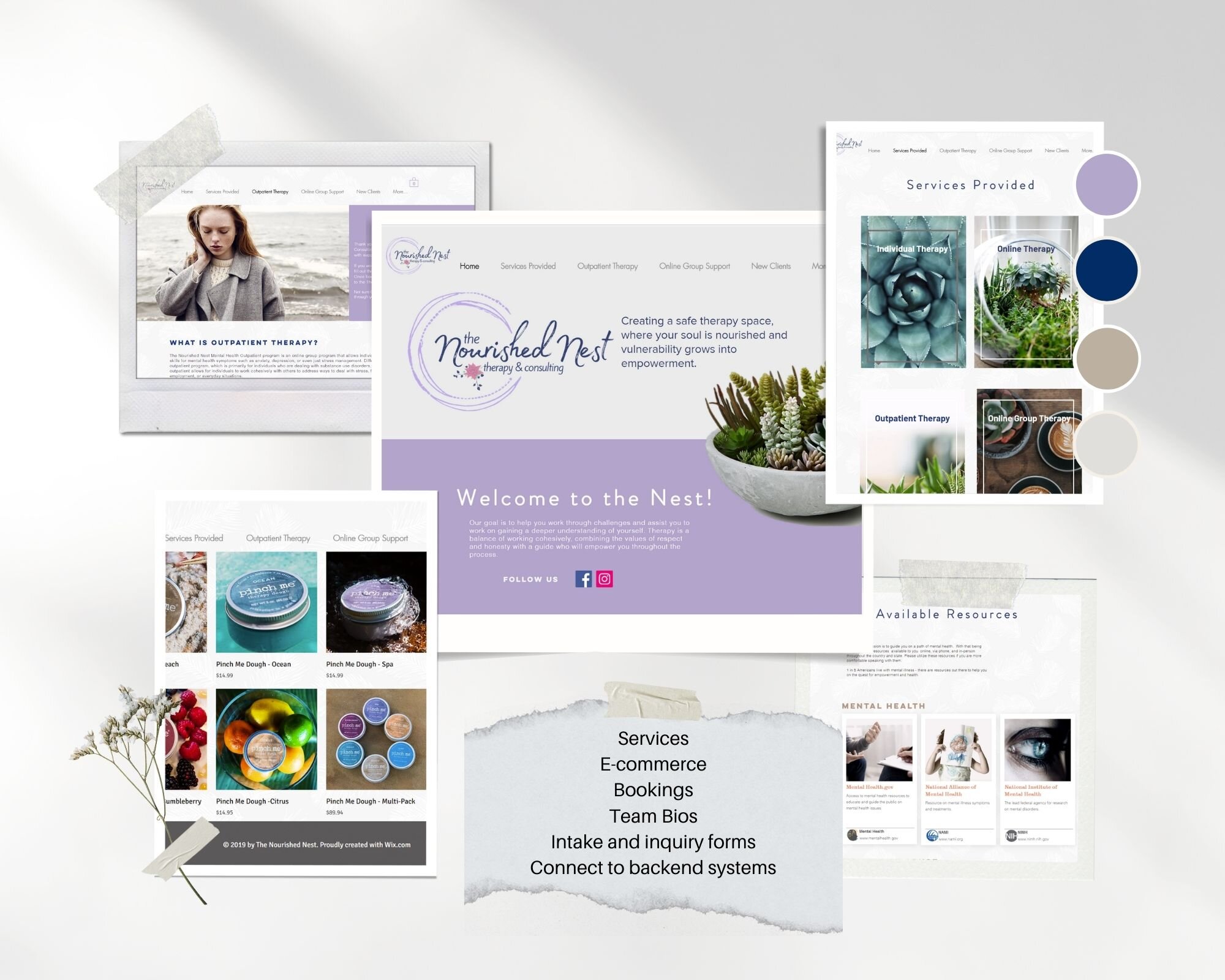
The first version of the website connected to her existing back-end systems and consisted of an about me section, a page outlining services she provided, and a contact form for new and existing clients. She also wanted to have a place for people to go and find additional resources.
During the initial launch, Monica received praise from current and new clients alike that mentioned ist was easy to navigate and easy to log into their system.
After a few months, Monica branched out on her own and looked to expand the website to include:
A connection to a new backend system for new and existing patients to book appointments
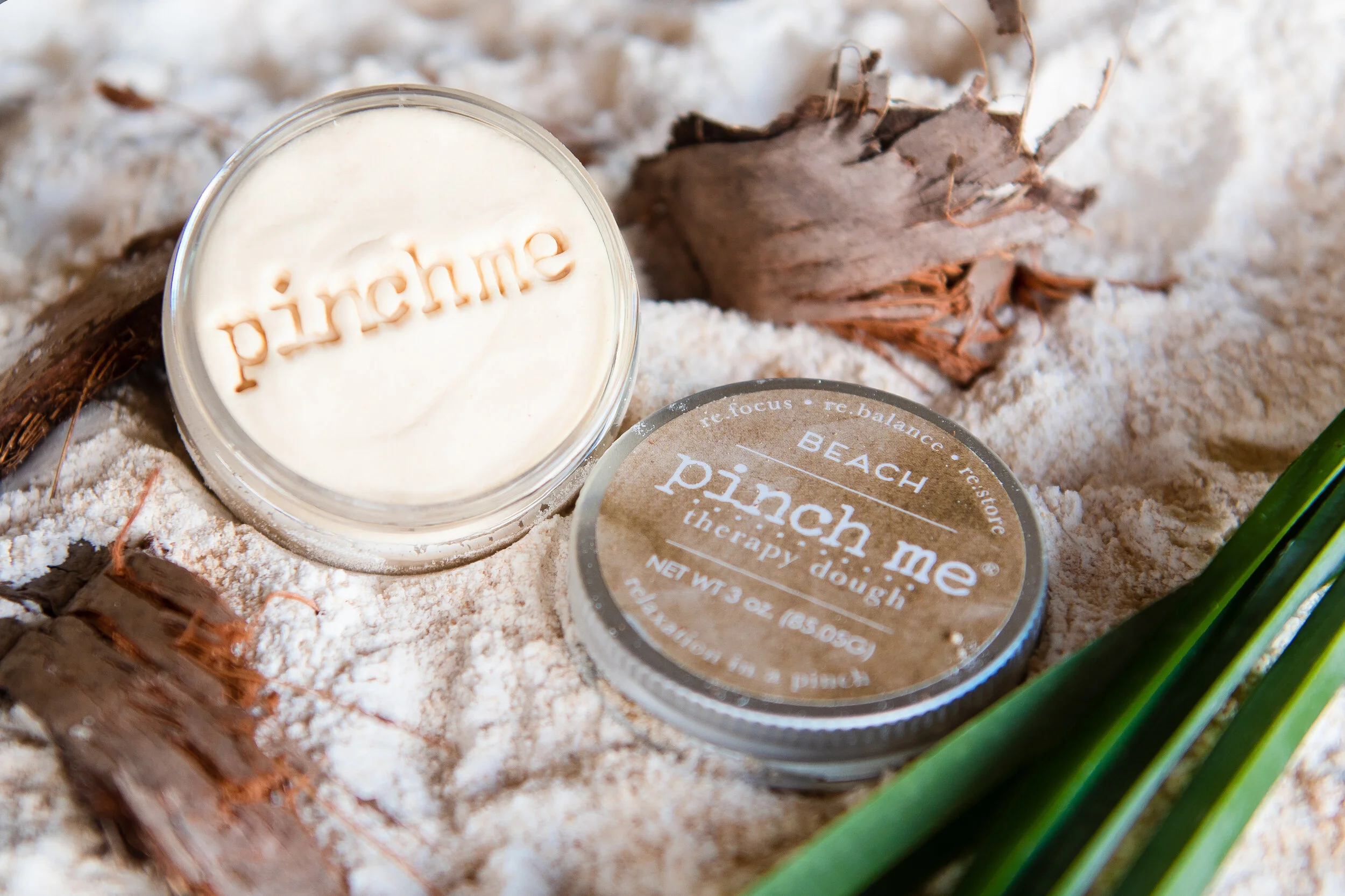
An online store to sell products
An online booking system for online support and therapy sessions
Monica has told me that she is thankful for the look and feel of her website. It gives her something to show off and be proud of as she expands her business into multiple states. She is now able to help more people. Since the initial launch of the website, Monica has added six new therapists to The Nourished Nest practice and serve countless new patients across Texas and the Northeast.


